DiarioHilario
Freelance work, currently ongoing 👉🏼 diariohilario.com 🚧
DiarioHilario is a community-driven platform designed to share local interests, recommendations and resources.
The project explores a different model from traditional social networks: moving away from traditional social feeds toward group-centered spaces.
I worked on redefining the product structure and designing a clearer interaction model.
Client
Alberto
Services
UX/UI Design
Timeline
November 2025 – Now
[ THE CHALLENGE ]:
The first version of the platform already existed but the concept was difficult to understand for new users.
Key issues included:
unclear navigation structure
too many options on the homepage
difficulty understanding what made the platform different from other social networks
The challenge was to clarify the product structure while keeping the founder’s vision.

[Old DiarioHilario homepage]

[Analysis of everything that fails on the main screens]
[ RETHINKING ]:
During early discussions the founder clarified an important idea: the platform should not revolve around posts, but around communities as spaces for content.
Groups could function as:
Discussion spaces
Curated resource boards (landing pages)
Themed content hubs (for example movie boards linking to full films on YouTube)
Personal page (like Facebook business page)
This meant rethinking the structure away from a traditional social feed

[ PROBLEM ]:
How is it possible to have a group that is actually a landing page? Or something even different from the "Group" full of posts we are used to?
Then, I remembered Discord. This gaming chat, where there's actually a small marketplace (landing page) in the home.
I'm still research, and as the client's focus was different, I had proposed a different navigation bar. Slack also has a similar layout.
I joined to lots of channels to know how the side panel collapsed works, and I just make a "twist":
Diario–Hilario is the concept to "threading" people through groups, so I introduced a "mesh/fusion" concept into the navigation bar, that separate (but unify at the same time) categories, like search bar, home, groups, profile and setting.

[On the left side, Discord interface with landing page. On the right side, Slack interface]


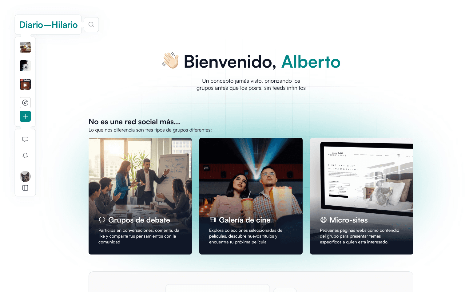
[ THE SOLUTION ]:
My first proposal for the main group page, followed a more traditional social feed structure, but after talking with the client, I realized the focus wasn't on individual posts, like other social media, but on the group instead. He didn't know exactly how he wanted the design, but he knew he wanted the focus to be on the group.
The challenge was figuring out how to convey that importance.
So I thought about the newspaper concept he mentioned, and came up with this column-based layout, just like a newspaper. It also gives more weight to all posts as a whole, rather than highlighting any single one.

[ CONCLUSIONS ]:
🚧 DiarioHilario is still evolving and new types of community spaces are being explored.
For example, some groups function as curated movie boards linking to full films available on YouTube.


DiarioHilario
Freelance work, currently ongoing 👉🏼 diariohilario.com 🚧
DiarioHilario is a community-driven platform designed to share local interests, recommendations and resources.
The project explores a different model from traditional social networks: moving away from traditional social feeds toward group-centered spaces.
I worked on redefining the product structure and designing a clearer interaction model.
Client
Alberto
Services
UX/UI Design
Timeline
November 2025 – Now
[ THE CHALLENGE ]:
The first version of the platform already existed but the concept was difficult to understand for new users.
Key issues included:
unclear navigation structure
too many options on the homepage
difficulty understanding what made the platform different from other social networks
The challenge was to clarify the product structure while keeping the founder’s vision.
[Old DiarioHilario homepage]
[Analysis of everything that fails on the main screens]
[ RETHINKING ]:
During early discussions the founder clarified an important idea: the platform should not revolve around posts, but around communities as spaces for content.
Groups could function as:
Discussion spaces
Curated resource boards (landing pages)
Themed content hubs (for example movie boards linking to full films on YouTube)
Personal page (like Facebook business page)
This meant rethinking the structure away from a traditional social feed
[ PROBLEM ]:
How is it possible to have a group that is actually a landing page? Or something even different from the "Group" full of posts we are used to?
Then, I remembered Discord. This gaming chat, where there's actually a small marketplace (landing page) in the home.
I'm still research, and as the client's focus was different, I had proposed a different navigation bar. Slack also has a similar layout.
I joined to lots of channels to know how the side panel collapsed works, and I just make a "twist":
Diario–Hilario is the concept to "threading" people through groups, so I introduced a "mesh/fusion" concept into the navigation bar, that separate (but unify at the same time) categories, like search bar, home, groups, profile and setting.
[On the left side, Discord interface with landing page. On the right side, Slack interface]
[ THE SOLUTION ]:
My first proposal for the main group page, followed a more traditional social feed structure, but after talking with the client, I realized the focus wasn't on individual posts, like other social media, but on the group instead. He didn't know exactly how he wanted the design, but he knew he wanted the focus to be on the group.
The challenge was figuring out how to convey that importance.
So I thought about the newspaper concept he mentioned, and came up with this column-based layout, just like a newspaper. It also gives more weight to all posts as a whole, rather than highlighting any single one.
[ CONCLUSIONS ]:
🚧 DiarioHilario is still evolving and new types of community spaces are being explored.
For example, some groups function as curated movie boards linking to full films available on YouTube.