ACAU
ACAU is Uruguay's national Film and Audiovisual Agency, created in 2023 and connected to the Ministry of Education and Culture. It administers the country's Fund for Cinematographic and Audiovisual Development, running yearly public calls ("convocatorias") for script development, production, video games, and international co-production support.
ACAU is a client of Poddera, the company I worked for at the time. My job was to adapt Poddera's internal portal product, used across several institutional clients, to ACAU's brand and application flow.
The people using this portal aren't ACAU's staff: they're external audiovisual professionals and production companies who log in to browse open calls, submit applications with supporting documentation, and track the status of their submission through a formal review process.
Client
ACAU
Services
UX/UI Design
Timeline
June 2023 – September 2023
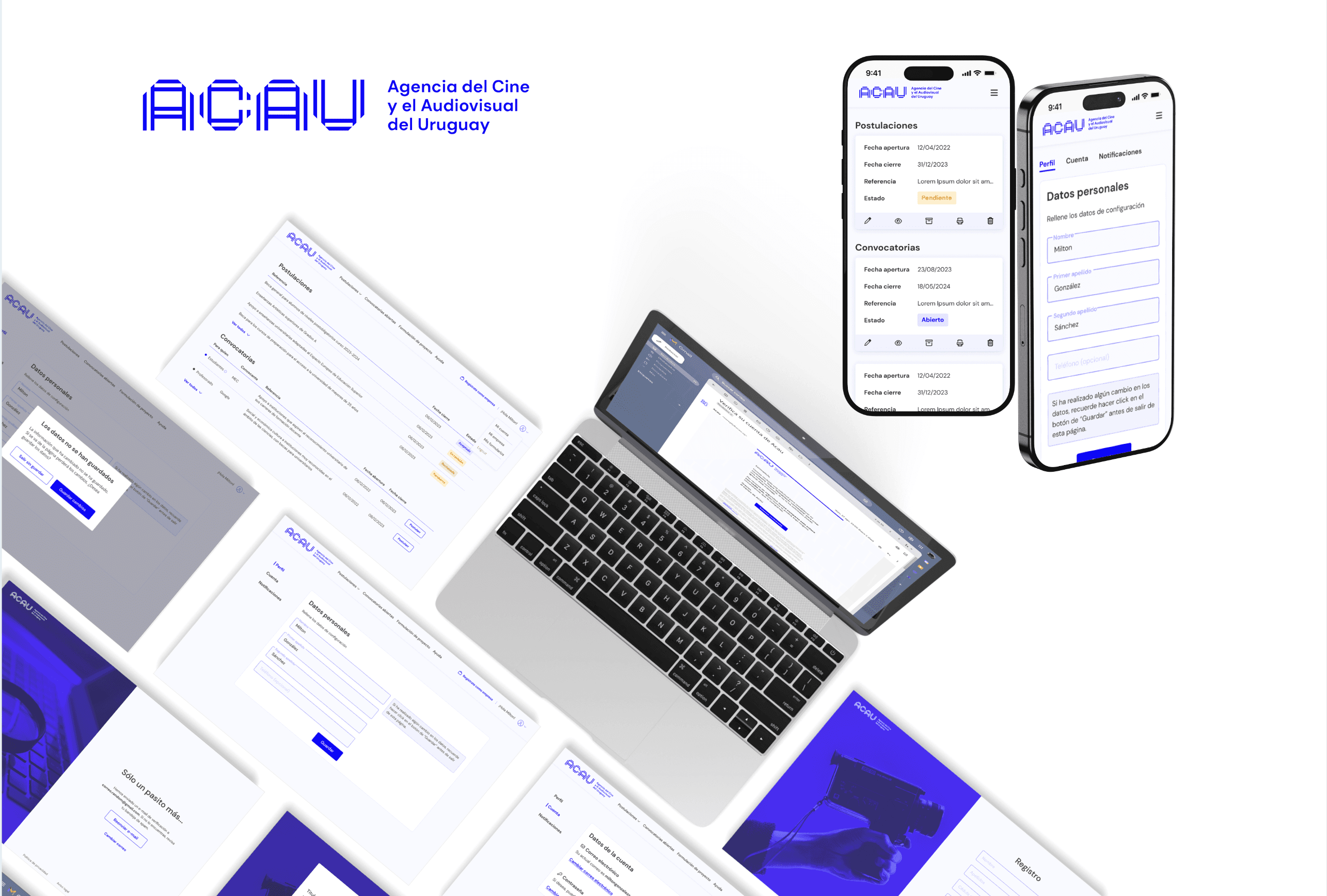
[THE CHALLENGE]:
The project presented many challenges.
No visual identity beyond a logo and one primary color. ACAU had just been created; there was no brand system, typography, or tone of voice to build on yet.
A diverse, high-stakes user base applying for public funding. The portal served external audiovisual professionals and production companies (from first-time individual filmmakers to established studios). Each with different levels of digital fluency, all navigating a formal public-funding process. I led the work of understanding these users and their application journey so the interface could guide such a varied audience with confidence.
Complex application states with real consequences. Applying to public funds means eligibility rules, legal deadlines, and multi-stage review. Users needed to know at a glance whether a submission was a draft, submitted, under review, needed corrections, or was resolved, because an unclear state can cost someone their funding. Making these states legible and actionable was central to the design.
A fixed, pre-built product. The portal’s structure and functionality were owned and maintained by the dev team. My role was to design within an existing information architecture, working closely with developers on what was flexible and what wasn’t, rather than defining a new one.
The task was to translate a single brand element into a coherent interface system, inside a rigid technical structure, for a use case where clarity isn’t a nice-to-have — it’s the product’s core value.
[MINI DESIGN SYSTEM]:
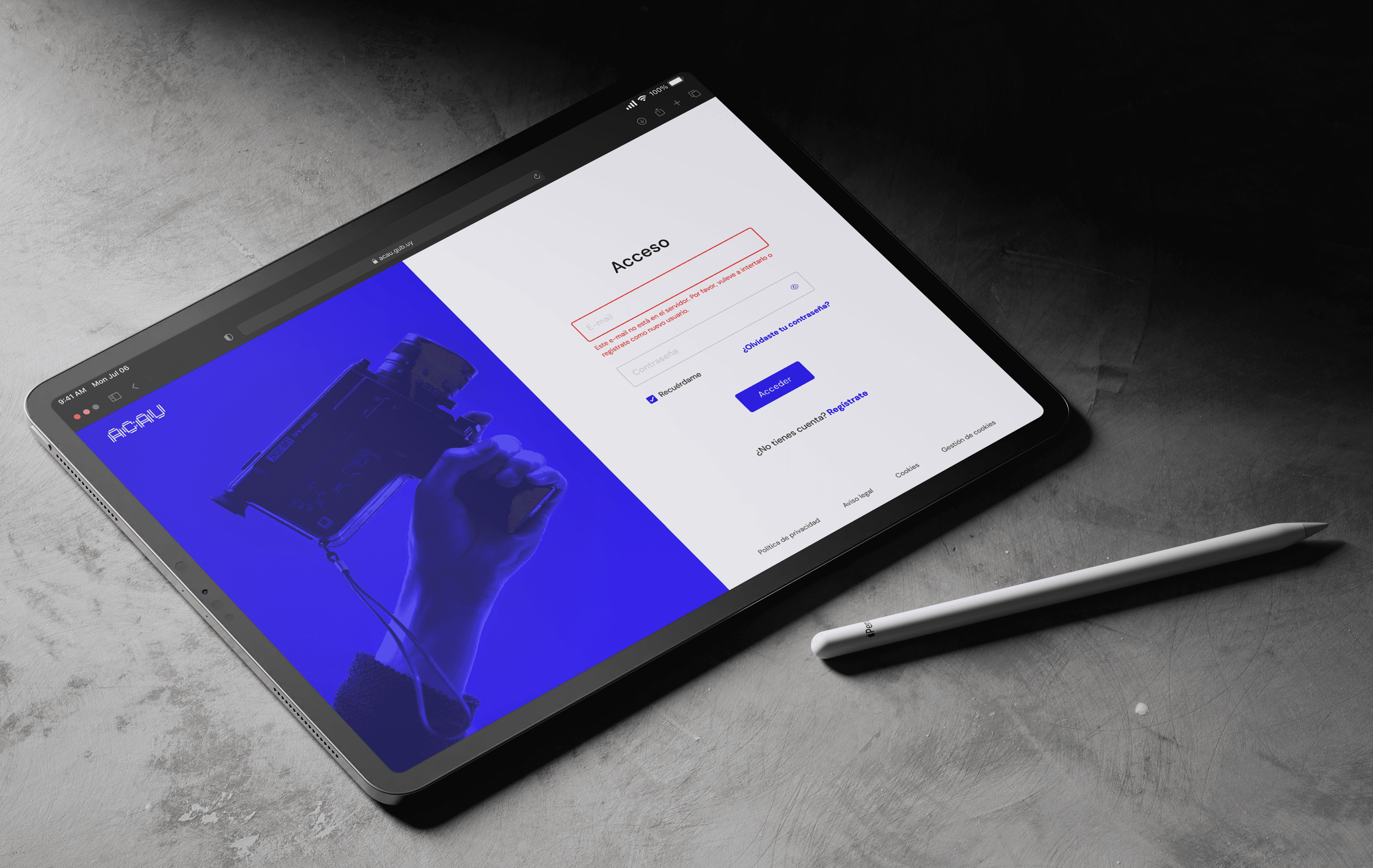
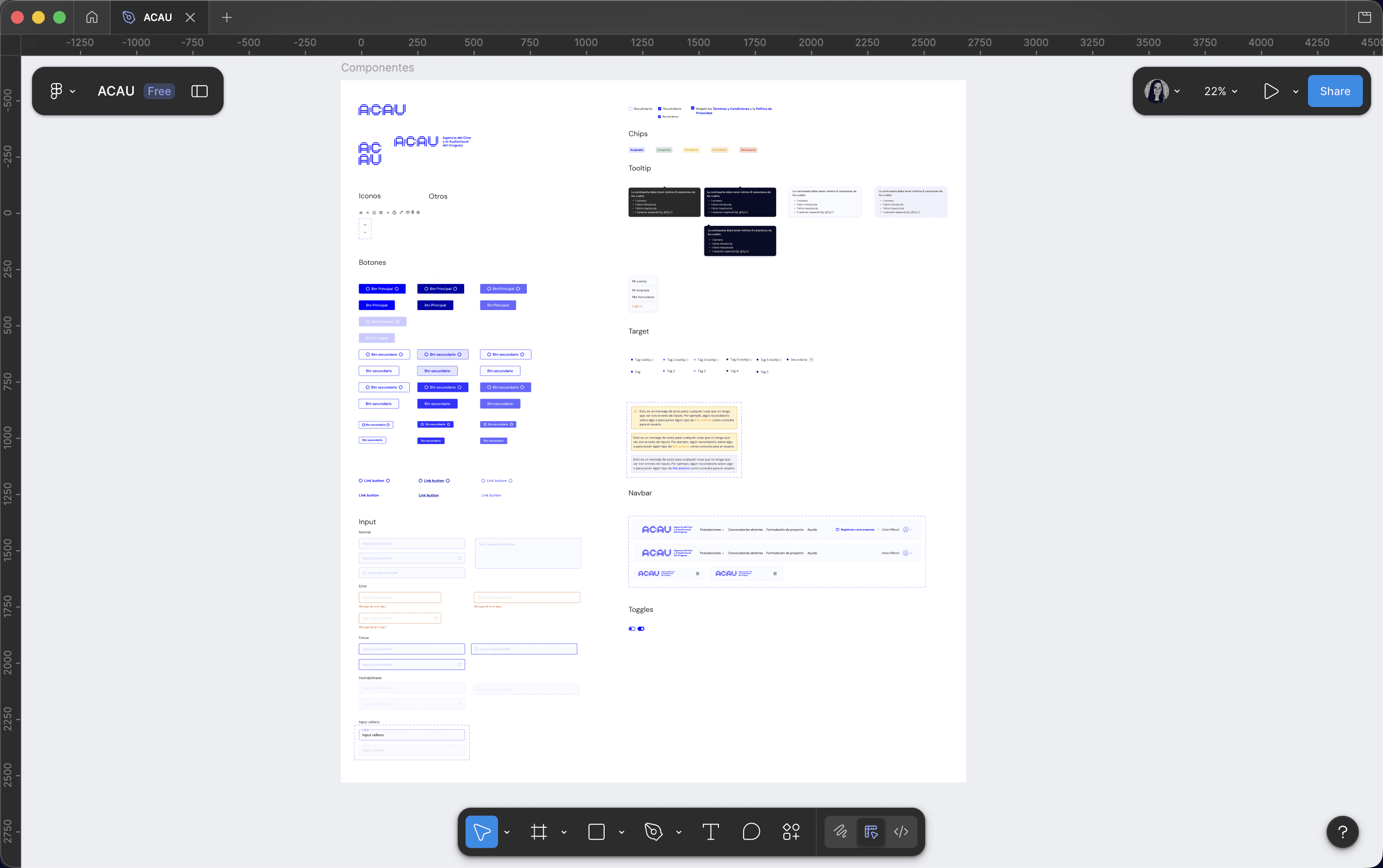
Since no brand guide existed, I created a lightweight UI kit to support the portal interface.
The goal was to establish visual consistency across all screens while keeping the design simple and maintainable.
This allowed the portal to remain visually consistent while supporting the different user flows within the platform.
[MAIN PORTAL]:
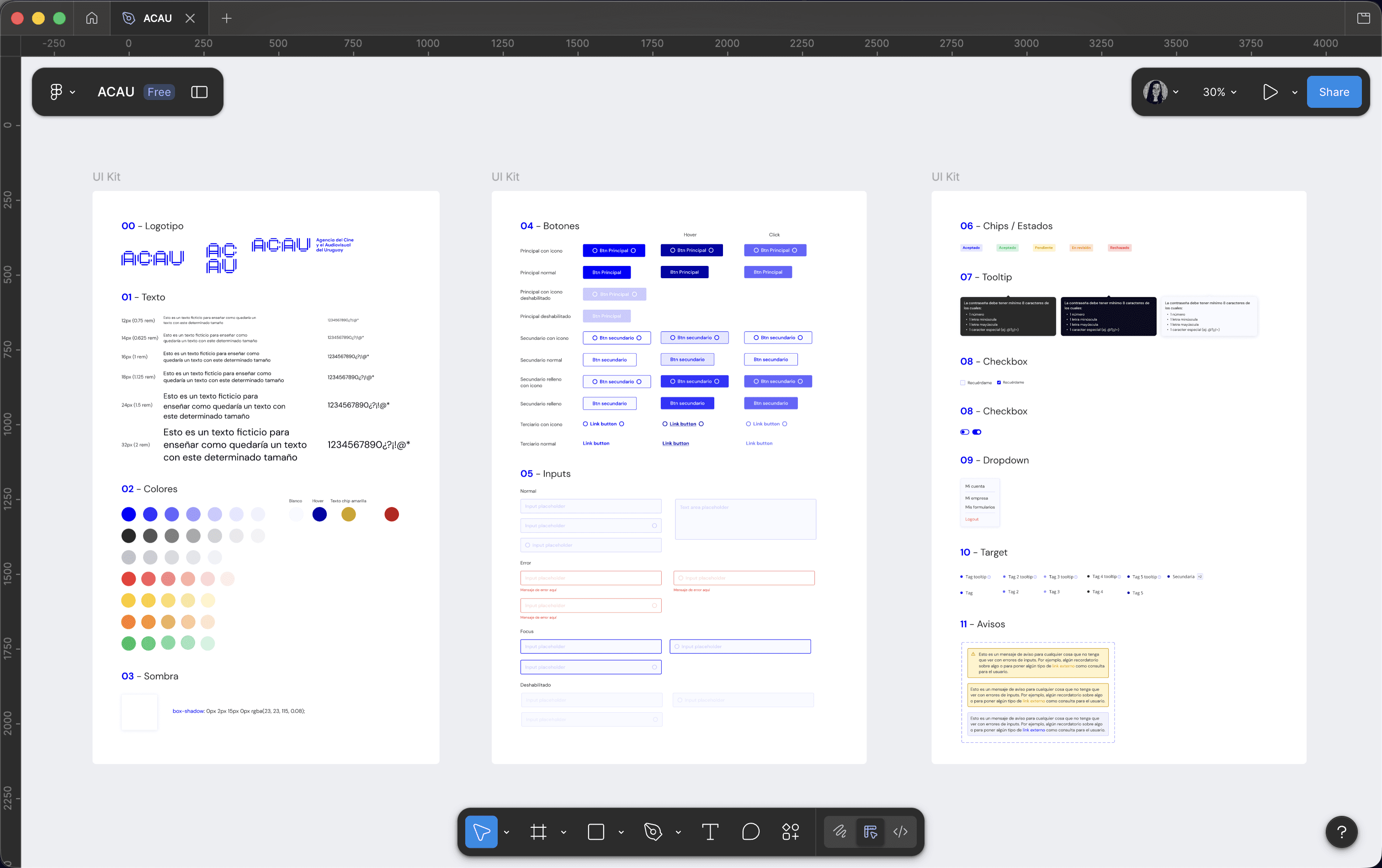
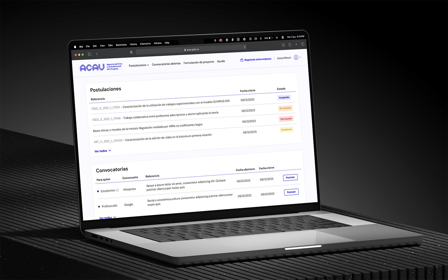
The portal allows users to browse opportunities, apply to calls, and manage their applications.
The main interface is structured around a dashboard containing calls, applications, and user information; a clear data tables for browsing calls and status.
Because the platform handles institutional processes, clarity and usability were prioritised over visual complexity.
[USER SETTINGS]:
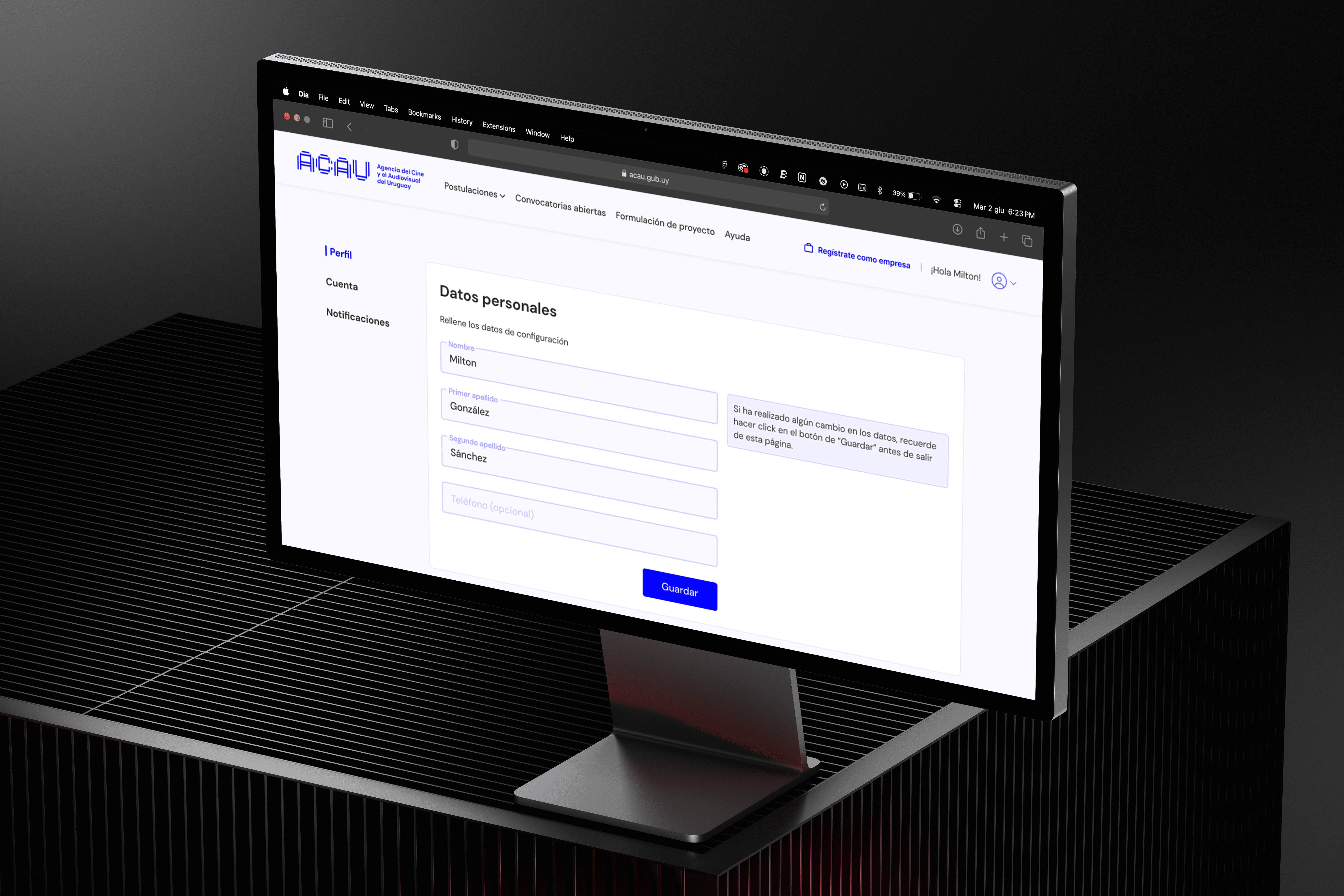
Another part of the project involved designing the user account area where users can manage their personal information.
The goal was to keep the interface straightforward so users could easily manage their information without confusion.
[CONCLUSIONS]:
This project highlighted the importance of designing within constraints.
Working from a minimal visual identity required translating a single brand element into a usable interface system

ACAU
ACAU is Uruguay's national Film and Audiovisual Agency, created in 2023 and connected to the Ministry of Education and Culture. It administers the country's Fund for Cinematographic and Audiovisual Development, running yearly public calls ("convocatorias") for script development, production, video games, and international co-production support.
ACAU is a client of Poddera, the company I worked for at the time. My job was to adapt Poddera's internal portal product, used across several institutional clients, to ACAU's brand and application flow.
The people using this portal aren't ACAU's staff: they're external audiovisual professionals and production companies who log in to browse open calls, submit applications with supporting documentation, and track the status of their submission through a formal review process.
Client
ACAU
Services
UX/UI Design
Timeline
June 2023 – September 2023
[THE CHALLENGE]:
The project presented many challenges.
No visual identity beyond a logo and one primary color. ACAU had just been created; there was no brand system, typography, or tone of voice to build on yet.
A diverse, high-stakes user base applying for public funding. The portal served external audiovisual professionals and production companies (from first-time individual filmmakers to established studios). Each with different levels of digital fluency, all navigating a formal public-funding process. I led the work of understanding these users and their application journey so the interface could guide such a varied audience with confidence.
Complex application states with real consequences. Applying to public funds means eligibility rules, legal deadlines, and multi-stage review. Users needed to know at a glance whether a submission was a draft, submitted, under review, needed corrections, or was resolved, because an unclear state can cost someone their funding. Making these states legible and actionable was central to the design.
A fixed, pre-built product. The portal’s structure and functionality were owned and maintained by the dev team. My role was to design within an existing information architecture, working closely with developers on what was flexible and what wasn’t, rather than defining a new one.
The task was to translate a single brand element into a coherent interface system, inside a rigid technical structure, for a use case where clarity isn’t a nice-to-have — it’s the product’s core value.
[MINI DESIGN SYSTEM]:
Since no brand guide existed, I created a lightweight UI kit to support the portal interface.
The goal was to establish visual consistency across all screens while keeping the design simple and maintainable.
This allowed the portal to remain visually consistent while supporting the different user flows within the platform.
[MAIN PORTAL]:
The portal allows users to browse opportunities, apply to calls, and manage their applications.
The main interface is structured around a dashboard containing calls, applications, and user information; a clear data tables for browsing calls and status.
Because the platform handles institutional processes, clarity and usability were prioritised over visual complexity.
[USER SETTINGS]:
Another part of the project involved designing the user account area where users can manage their personal information.
The goal was to keep the interface straightforward so users could easily manage their information without confusion.
[CONCLUSIONS]:
This project highlighted the importance of designing within constraints.
Working from a minimal visual identity required translating a single brand element into a usable interface system
ACAU
ACAU is Uruguay's national Film and Audiovisual Agency, created in 2023 and connected to the Ministry of Education and Culture. It administers the country's Fund for Cinematographic and Audiovisual Development, running yearly public calls ("convocatorias") for script development, production, video games, and international co-production support.
ACAU is a client of Poddera, the company I worked for at the time. My job was to adapt Poddera's internal portal product, used across several institutional clients, to ACAU's brand and application flow.
The people using this portal aren't ACAU's staff: they're external audiovisual professionals and production companies who log in to browse open calls, submit applications with supporting documentation, and track the status of their submission through a formal review process.
Client
ACAU
Services
UX/UI Design
Timeline
June 2023 – September 2023
[THE CHALLENGE]:
The project presented many challenges.
No visual identity beyond a logo and one primary color. ACAU had just been created; there was no brand system, typography, or tone of voice to build on yet.
A diverse, high-stakes user base applying for public funding. The portal served external audiovisual professionals and production companies (from first-time individual filmmakers to established studios). Each with different levels of digital fluency, all navigating a formal public-funding process. I led the work of understanding these users and their application journey so the interface could guide such a varied audience with confidence.
Complex application states with real consequences. Applying to public funds means eligibility rules, legal deadlines, and multi-stage review. Users needed to know at a glance whether a submission was a draft, submitted, under review, needed corrections, or was resolved, because an unclear state can cost someone their funding. Making these states legible and actionable was central to the design.
A fixed, pre-built product. The portal’s structure and functionality were owned and maintained by the dev team. My role was to design within an existing information architecture, working closely with developers on what was flexible and what wasn’t, rather than defining a new one.
The task was to translate a single brand element into a coherent interface system, inside a rigid technical structure, for a use case where clarity isn’t a nice-to-have — it’s the product’s core value.
[MINI DESIGN SYSTEM]:
Since no brand guide existed, I created a lightweight UI kit to support the portal interface.
The goal was to establish visual consistency across all screens while keeping the design simple and maintainable.
This allowed the portal to remain visually consistent while supporting the different user flows within the platform.
[MAIN PORTAL]:
The portal allows users to browse opportunities, apply to calls, and manage their applications.
The main interface is structured around a dashboard containing calls, applications, and user information; a clear data tables for browsing calls and status.
Because the platform handles institutional processes, clarity and usability were prioritised over visual complexity.
[USER SETTINGS]:
Another part of the project involved designing the user account area where users can manage their personal information.
The goal was to keep the interface straightforward so users could easily manage their information without confusion.
[CONCLUSIONS]:
This project highlighted the importance of designing within constraints.
Working from a minimal visual identity required translating a single brand element into a usable interface system